 HealthViewer
Trends
Trends charts any lab test over time and shows how values line up with medications, journal notes, and life events.
Selecting Tests
Section titled “Selecting Tests”Open the test selector at the top of the page to pick what to chart. It is a checklist with a search box, so you can type part of a name to narrow the list. You can chart up to 20 tests at once, and the selector shows how many you have chosen.
Two filters help with long test lists:
- Filter by tag. Click a tag above the selector, such as Heart or Thyroid, to limit the list to tests with that tag. Click it again, or click Show all, to clear it.
- Panel filter. The All panels menu next to the selector limits the list to one panel, such as Lipid Panel. It is hidden while a tag filter is active.
Tests you have merged in the Test Catalog chart as one series, so a name that changed between labs still shows as a single line.
Time Range
Section titled “Time Range”Choose 3 months, 6 months, 1 year, 2 years, 5 years, or All time. The range is measured back from today. All time is the default.
When the same test was reported in different units, Trends converts the values to one unit so they can share a chart. The chart title shows the unit being used. If a result is in a unit that cannot be converted, it is left off the chart and listed under it with a note, rather than being plotted on the wrong scale.
View Modes
Section titled “View Modes”Individual View (default)
Section titled “Individual View (default)”Each test gets its own card. Choose what each card shows:
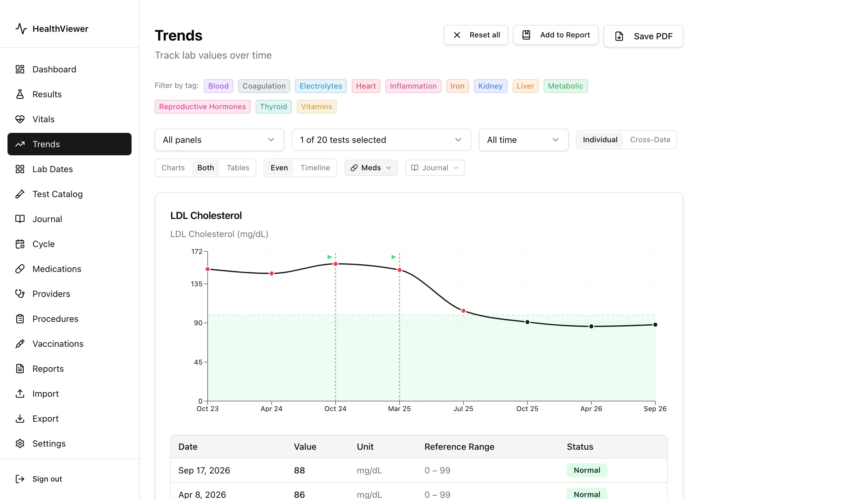
- Charts: a line chart with the reference range shaded behind it
- Tables: the date, value, unit, reference range, and status for each result
- Both: the chart above the table (the default)
Points are colored by status, so out-of-range results stand out.
X-axis options:
- Even: equal spacing between results, whatever the calendar gap
- Timeline: spacing proportional to time, so gaps appear where there were no results
Medication, journal, and cycle overlays are available in this view only.
Cross-Date View
Section titled “Cross-Date View”All selected tests appear side by side in one table, with a column for each visit date. Use it to review a whole panel, such as every CBC value, across several draws.
Overlay View
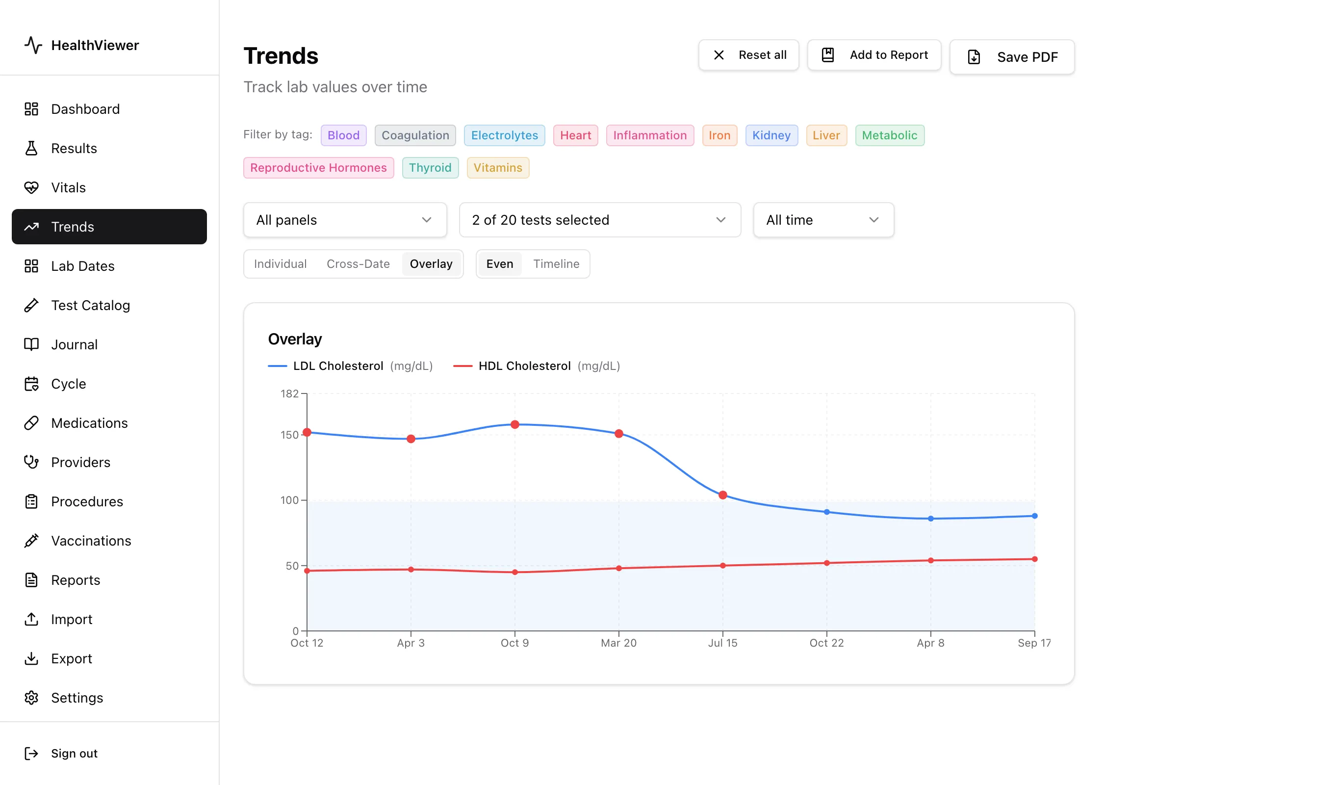
Section titled “Overlay View”Available when two or more tests are selected. All tests are plotted on one shared chart, each in its own color, with a legend showing the test name and unit. A faint reference-range band is drawn for each test. Points turn red for Abnormal values and amber for Borderline, whatever the line color. Use it to compare related tests, such as LDL and HDL cholesterol or Free T3 and Free T4.
The Even and Timeline options work here too. Medication, journal, and cycle overlays do not appear in this view.
Reference Ranges
Section titled “Reference Ranges”The shaded band on each chart is the reference range reported by the lab. If you have set a custom range for a test in the Test Catalog, the chart uses your range instead and shows a Custom range label next to the test name, along with your note if you added one. Use a custom range to track toward a personal target that differs from the lab’s range. Ranges are edited in the Test Catalog, not on the Trends page.
Medication Overlays
Section titled “Medication Overlays”Open the Meds menu and check Show meds to draw a marker on each chart where a medication started or stopped:
- Started: a green dashed line with a ▶ marker
- Stopped: an orange dashed line with a ■ marker
Once meds are showing, the same menu lists each medication so you can hide the ones that are not relevant. Medications you have marked as historical (“tried before”) are not shown. Meds are hidden by default.
Below the charts, a Medication changes in this range list gives the date of every start and stop in the selected time range.
Journal Overlays
Section titled “Journal Overlays”Open the Journal menu and check Show journal to mark each journal entry on the charts. Click a marker to read the entry. The menu lists your journal tags, so you can show only entries with the tags you choose. Journal entries are hidden by default.
Below the charts, a Journal notes in this range list shows the matching entries, newest first.
Cycle Overlay
Section titled “Cycle Overlay”When you track your cycle in Cycle with lab context turned on, a Cycle button appears in the toolbar. In Timeline mode it shades logged period days behind each chart and outlines the predicted next period. Hover any point to see the cycle day and phase it was drawn on.
Reset All
Section titled “Reset All”Reset all appears once anything differs from the defaults. It clears the selected tests, time range, tag filter, view mode, display and x-axis options, and the medication and journal overlays.
Adding to a Custom Report
Section titled “Adding to a Custom Report”Once at least one test is selected, click Add to Report to save the current view to a new or existing Custom Report. Each test is saved as its own item, so you can reorder or remove tests inside the report. The item keeps the time range, display mode, x-axis option, and overlay settings. A view saved from Overlay mode is added as individual charts. See Custom Reports for more.
Saving a PDF
Section titled “Saving a PDF”Once at least one test is selected, click Save PDF to save the current charts as a PDF, which is useful for sharing with a provider. The toolbar and filters are left out of the PDF. You can also use your system’s Print command.
- Select several related tests, such as Iron, TIBC, and % Saturation, and use Cross-Date view to see the full panel for each visit date.
- Turn on medication overlays to see whether starting a new medication moved a value in the expected direction, then check the Medication Effect report for a before-and-after table.
- Tag journal entries, for example “symptoms” or “diet change”, and filter the Journal menu so each chart shows only the notes that matter for it.
- Status colors for chart points are configurable in Settings → Appearance.