How to track your lab results over time
A single lab result answers one question: is this value in range today? A history of the same test answers better ones. Is it drifting? How much does it usually bounce around? Did anything you changed actually move it?
Building that history is not complicated, but it does not happen by itself. Your results are spread across the portals of every clinic, hospital, and lab that ever drew your blood. Here is a method that works whether you use a spreadsheet, an app, or a folder of printouts.
1. Gather everything in one place
Start by collecting every result you can find, not just the recent ones:
- Patient portals. Download from each health system you have used. Most US systems run MyChart, and How to download your lab results from MyChart covers the options.
- Lab company portals. Quest and LabCorp each have their own patient portals with downloadable reports, including tests ordered by doctors whose systems you cannot reach.
- Paper. Old printouts, employer screenings, urgent care visits, and direct-to-consumer tests all count.
- Formal requests. For anything older, you have a legal right to a copy of your record. Ask the records department at the clinic or hospital.
Older results are worth the effort. A baseline from five years ago is often the most useful number in the whole history, because it shows what normal looked like for you before anything changed.
2. Record the same fields for every result
Whatever you use, capture the same details every time:
| Field | Why it matters |
|---|---|
| Collection date | When the sample was taken. Use this, not the date the report was issued. |
| Test name | Spelled one way. “Hemoglobin A1c”, “HbA1c”, and “A1C” should be one test. |
| Value | Exactly as reported. |
| Unit | Values in different units cannot be compared directly. |
| Reference range | As printed on that report. Each lab sets its own. |
| Lab or source | Explains jumps when you switch labs. |
Test names drift between labs and even between years at the same lab. Pick one name per test and use it everywhere, or your history splits into several short ones.
Units are the most common source of false trends. Glucose, for example, is reported in mg/dL in the United States and in mmol/L in much of the world, and 5.5 mmol/L is about 99 mg/dL. Convert before you compare, or keep each unit in its own column.
Reference ranges differ between labs because instruments and methods differ. Record the range that came with each result, instead of applying one range to every value.
3. Write down the context
A number without context is hard to read later. Next to each draw, or in a separate log, note anything that could have moved it:
- Medication starts, stops, and dose changes, with dates
- Whether you were fasting, and the time of day
- Recent illness, injury, hard exercise, or poor sleep
- Changes in diet, alcohol, or supplements
- For people who menstruate, the day of the cycle. Several common tests move with it, as Your cycle shows up in your labs explains.
These notes are what turn “my ferritin dropped” into “my ferritin dropped the month I stopped the supplement”.
4. Chart each test on its own
Numbers in a table are hard to read as a trend. A simple line chart per test, with the reference range shaded behind it, makes direction obvious at a glance.
A few habits make charts more honest:
- Plot by date, not by row. Two results a week apart and two results three years apart should not look the same distance apart.
- Show the reference range, but read the line, not just the band. A value that has climbed steadily for years can still sit inside the range.
- Mark medication changes on the same chart. The before-and-after is the evidence that a change did something.
5. Read the trend, not the latest point
Every lab value moves a little from draw to draw, even when nothing is going on. Some of that is the test itself, and most of it is ordinary variation in your body from day to day. Researchers have measured this for hundreds of tests, and the EFLM Biological Variation Database publishes the figures.
So before reading much into a change, ask:
- Is it bigger than the usual spread of your earlier results?
- Is there more than one result pointing the same way?
- Did anything in your context notes change around the same time?
One surprising value is a reason to recheck. Several values moving in the same direction are a reason for a conversation. Did the medication actually do anything? goes deeper on reading a before-and-after fairly.
6. Bring it to your appointments
The payoff is the conversation. A chart of one test over five years gives your doctor something a single report cannot, especially if they only see the labs their own system ordered. Print or save the charts for the tests you want to discuss, along with the dates of any medication changes, and bring your questions.
Doing it in a spreadsheet
A spreadsheet works, and plenty of people have tracked for years this way. Use one row per result with the fields above, keep test names consistent, and build a chart per test. The work adds up, though. Every new report means typing values in by hand. Unit conversions are manual, and it is easy to get one wrong. Medication dates live in another tab, off the charts they belong on.
Doing it in HealthViewer
HealthViewer is a lab results tracker built to do these steps for you, on your own computer. It imports lab report PDFs, CSV files, and MyChart downloads, or it connects to your health system directly and pulls results as data. It normalizes test names, converts units so a test’s history can share one chart, and keeps each lab’s reference range with each result.
Charts plot any test over time with the reference range shaded, and they can mark medication starts and stops and your journal notes on the same timeline. You can also put related tests on one chart:
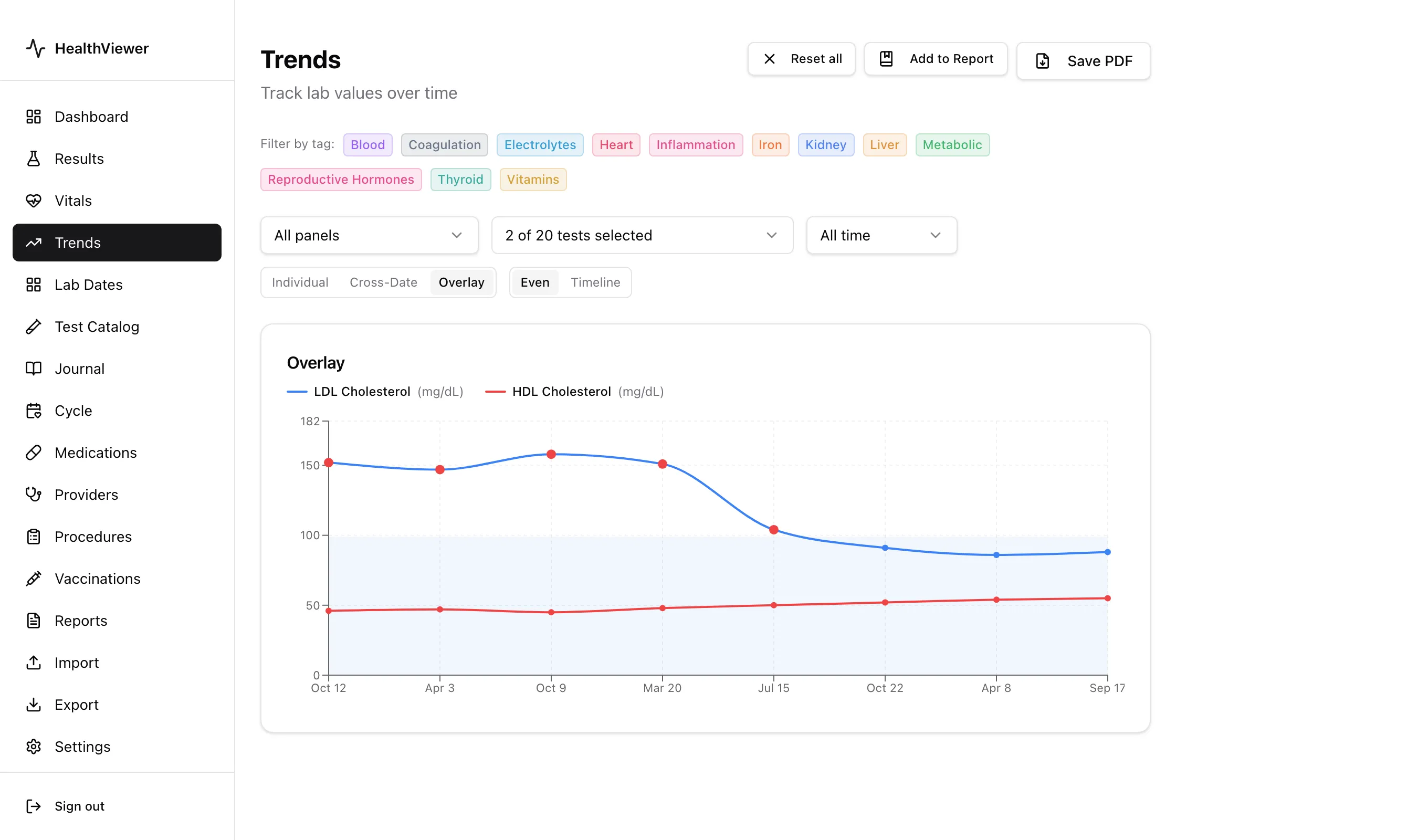
Example data: LDL and HDL cholesterol across eight draws over three years.
Everything is stored in an encrypted file on your computer, with no account and no cloud service. See Trends for how the charts work, or Getting Started to import your first results.
This post is general information, not medical advice. Talk to your clinician before acting on any change in your results.